
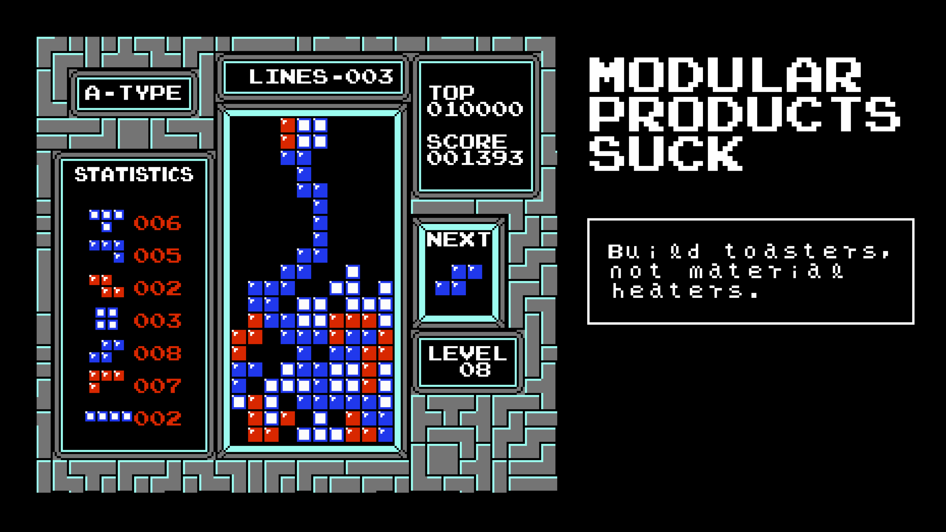
Modular Products Suck
Build toasters, not material heaters.

Modularity is seductive in product development: Rather than doing one thing, give the user a system of components—ingredients. Allow them to combine those ingredients to create the workflow they need. Kill 50 birds with 1 system.
I tried this a lot in my early journey as an engineer, and it failed 90% of the time. Now I believe that this tendency—let’s call it Modularity Bias—is one of the most common risks for early stage product teams.

Avoiding Hard Choices
Modularity is seductive because it frees us from the anxiety of making hard choices.
Building a great product requires tradeoffs. You need to say “no” to 80% of what customers ask for, in favour of the 20% that deeply matters. Otherwise you end up with a bloated product that serves no person in particular.
It’s stressful to make these subjective calls, so we gravitate towards building a solution that can “do it all”.
It’s easy to imagine how the meetings play out:
“Users want X, Y and Z—which should we focus on?”
“Easy—we can build a flexible system that can support all of those needs.”
It’s difficult to disagree with a position that makes every stakeholder happy.
Mentally, it’s like a completing a satisfying Sudoku puzzle. Snap, that’s it! We don’t need to make any hard choices. We can plug the hole elegantly in a way that satisfies all our needs. When you’re inexperienced, these solutions feel like architectural genius.
But…
Modular UX Almost Never Works
1. Failure by Complexity
Modular experiences require at least one extra layer of engineering complexity. This complexity spirals out in unexpected ways. A 1 week PoC becomes a 3 month PoC, becomes a 12 month herculean effort. Most modular products don’t succeed because they don’t get finished (see the reference to Phonebloks at the beginning of this article).
2. Failure by Bad Abstractions
If a modular product does get to a v1, it probably still sucks.
Reality has a surprising amount of detail (blog post). The lego brick abstractions we thought were genius start falling apart the moment we contact reality. We get feature requests that destroy our mental model—and we find ourselves rearchitecting 50% of the system we spent months building.
This is brutal if we’re still “exploring the idea maze”. Most product ideas are wrong. In this failure mode we may have slowed our iteration speed by a factor of 10 with no great benefit.
3. Failure by Bad UX
Even if we do functionally accomplish everything users asked for—our UX will often still cause the vast majority of users to churn.
People have become accustomed to hyper-specific, opinionated workflows in consumer products. In the age of TikTok attention spans are at an all-time low. Any moment of confusion or open-endedness can cause a user to bounce. The most successful UX in 2025 is the one-way doomscroll. No decisions at all: just scroll down.
Users generally won’t read your documentation. They won’t join a training call. And they definitely won’t “imagine the possibilities”. Either the guardrails force them to be immediately successful or they bounce.
It takes so much thoughtful polish to build a simple experience that 90% of users can flow through without issue. It’s typically impossible to do this kind of polish if you are optimizing for infinite flexibility.
The vast majority of people want toasters and kettles, not material heaters and water tanks. We can build much better, much simpler products when we build things that have a single purpose.
Start with the Specific
There’s an easy solution to this problem: always start by designing the optimal, non-modular experience for a user. What does the absolute peak, single-purpose experience look like? Bet with conviction on what exactly your user wants to do, and think out every detail for the best possible experience for that specific workflow.
Once you know what the optimum looks like, you can consider tradeoffs in the direction of modularity:
Are there existing components we could use to quickly build a compromised version of the vision?
Should we build a quick brittle, inflexible version to test our assumptions rapidly?
Or—is this a rare case where modularity might actually work well?
Generally I think a team should only commit to modularity when they have released a specific feature with proven product-market fit, and they are looking for ways to scale and expand that feature longterm. Otherwise, the team should start with the specific and assume that v1 will fail. You may need to build many brittle versions before finding something that hits.
Hidden Modularity
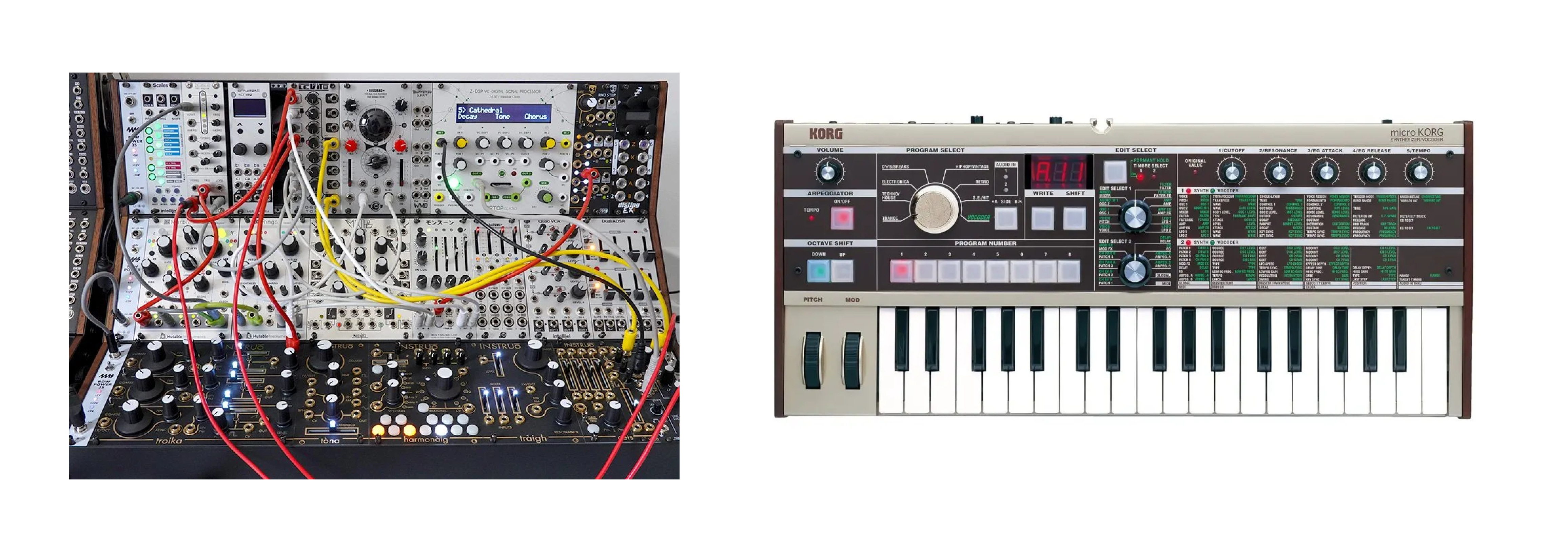
Up until now I’ve been speaking about user-facing modularity. But what about engineering modularity that is hidden from the user? This can useful and necessary—but it often still fails due to bad abstractions and complexity—and we need to be careful about how it leaks into the user experience.
My earliest memory of architecture leaking into the UX was seeing the gameplay code for Jumper (a precursor to Celeste and inspiration for Super Meatboy). Most game developers I knew would build a simple modular physics engine for their game, and then tweak a handful of physics parameters to get movement. A realistic physics engine seems like a flexible solution that can solve a lot of gameplay problems.
…And then when I saw the gameplay code for Jumper, I saw something entirely different: A wall of bespoke, monolithic code, hand-tuned “magic numbers”, deep nesting of if/else statements. A wall of movement logic that felt completely bespoke and immodular—completely unrelated to real physics.
And the game felt better than any platformer game I had played at the time. Because it was optimized to feel good to the user in a very specific use case, not optimized for implementation elegance or code reuse. It was optimized to solve something very specific, not the broad problem of physics.
Developer experience is important. But UX needs to come first, because most products fail not because they are technically difficult to build, but because users simply don’t like them.
Flexibility Through Simplicity
There’s one kind of product flexibility that works well: simplicity. If you can reduce the number of moving parts in your user experience, if you can really get to its essence—then users will find many uses for your product without confusion. The simplicity of ChatGPT’s chat box, or of Apple’s Notes app, are examples of applications that can serve a broad number of use cases through simplicity—not modularity.
The simplicity of my air fryer makes it a great way to make vegetables, meat, fish, french fries, nachos, meatballs and many other things. But there is no “fish” module. No “french fry basket”. These modules would complicate the product more than help it.
The Obvious Counterpoint: Enterprise Software
What about enterprise software? Companies like Salesforce have made a killing selling ridiculously configurable products.
1. These Products Aren’t Good
I didn’t assert that you couldn’t sell these products, only that they aren’t good. I’ve never met someone who said they loved Salesforce, other than the consultants that make a killing maintaining it. I have met people who love more opinionated CRMs like Hubspot and Pipedrive.
2. These Products Are Good for People Who Need a Reason to Get Their Hands Dirty
Modular products are extremely sellable to innovation committees and internal development teams who want to show their chops. If you want to be paid like a chef, you want to buy ingredients and show what you can do with them, rather than ordering a fully prepared meal from a restaurant. Enterprise buyers often have a team of people that want a reason to get their hands dirty.
3. Configuration Lock-In is a Good Business Model
Enterprise products can take an entire development team to setup and maintain. Once you’ve made this investment, it becomes extremely difficult to migrate to any other platform. Your Salesforce Apex code won’t run on Hubspot. This makes modular enterprise software an extremely retentive business, even if the products aren’t great.
It’s a valid way to win. But if your joy is product craft? Pure enterprise SaaS may not be the place for you.
Modularity in AI
The idea that chat systems like ChatGPT and Claude will simply hook into all your favourite apps through MCP and dominate all AI use is just another example of the engineer’s modular fantasy.
History has shown repeatedly that specific, monolithic, purpose-built workflows tend often win in the end. For example—there is a tactility to tuning designs in Figma that can never be achieved through chat prompts. Single purpose UIs for AI workflows are needed in all verticals.